Compared to what?
comparisons
alignment
Rcode
examples
Part 2: alignment and easing visual inspection. Following on from the previous post on comparisons, we now focus on how the alignment of a comparison is an important consideration.
During the design of data visualisation it is helpful to keep in mind the purpose – the “Compared to what?” (Tufte 1990). To facilitate effective comparisons there are a number of design options in the toolbox which can be used including layering, alignment, proximity and ordering.
Following on from the previous post, we now focus on how the alignment of a comparison is an important consideration.
Horizontal vs. vertical alignment
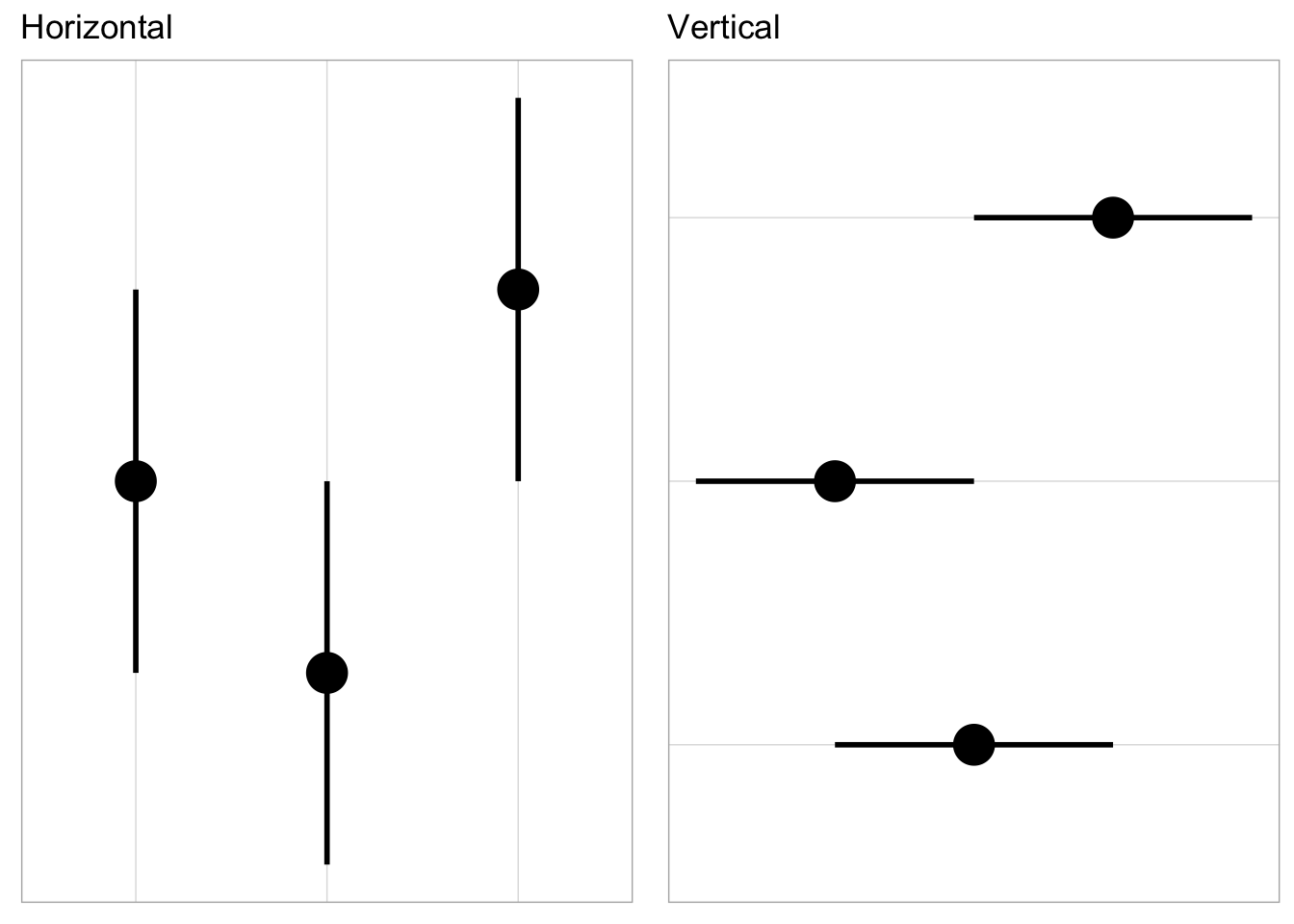
Alignment is another consideration for facilitating comparisons. Where appropriate, using a vertical comparison can help make judgments easier than the same comparisons horizontally aligned. To illustrate, consider three point estimates and associated uncertainty intervals.
First we set up R and generate the data.
We now plot the three intervals side by sided, aligned horizontally and vertically.
You can see that its “easier” to make comparisons scanning up and down than going from left to right. This is of course subjective but combined with potentially sorting comparisons by the point estimate can help guide judgments (Cleveland 1985).
Now back to the “when appropriate” caveat. If the comparison(s) are made on data that is sequential (i.e. a comparison of longitudinal effects), doing so may confuse the reviewer; time is often encoded better by flowing left to right.
A final rationale for selecting a vertical alignment of comparisons is that is can help with adding in contextual information such as longer informative labels.
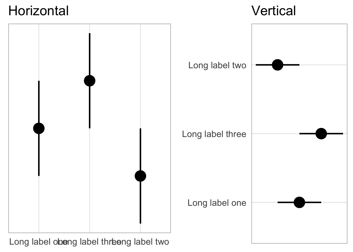
On the left-hand side the labels blend in together. Typically this requires shortening the label length through abbreviation or by other means such as changing the angle the text direction. By switching the alignment of the comparison (i.e. flipping the coordinates), the longer labels are easier to display without modification that may impact readability.
References
Cleveland, William S. 1985. The Elements of Graphing Data. Belmont, CA, USA: Wadsworth Publ. Co.
Tufte, Edward R. 1990. Envisioning Information. Cheshire, Conn.: Graphics Press.