Consider if a standard graph can be used by identifying suitable designs based on the: (i) purpose (i.e. message to be conveyed or question to answer) and (ii) data (i.e. variables to display). In this post we provide multiple examples and code from the graphics principles cheatsheet section: selecting the right base graph .
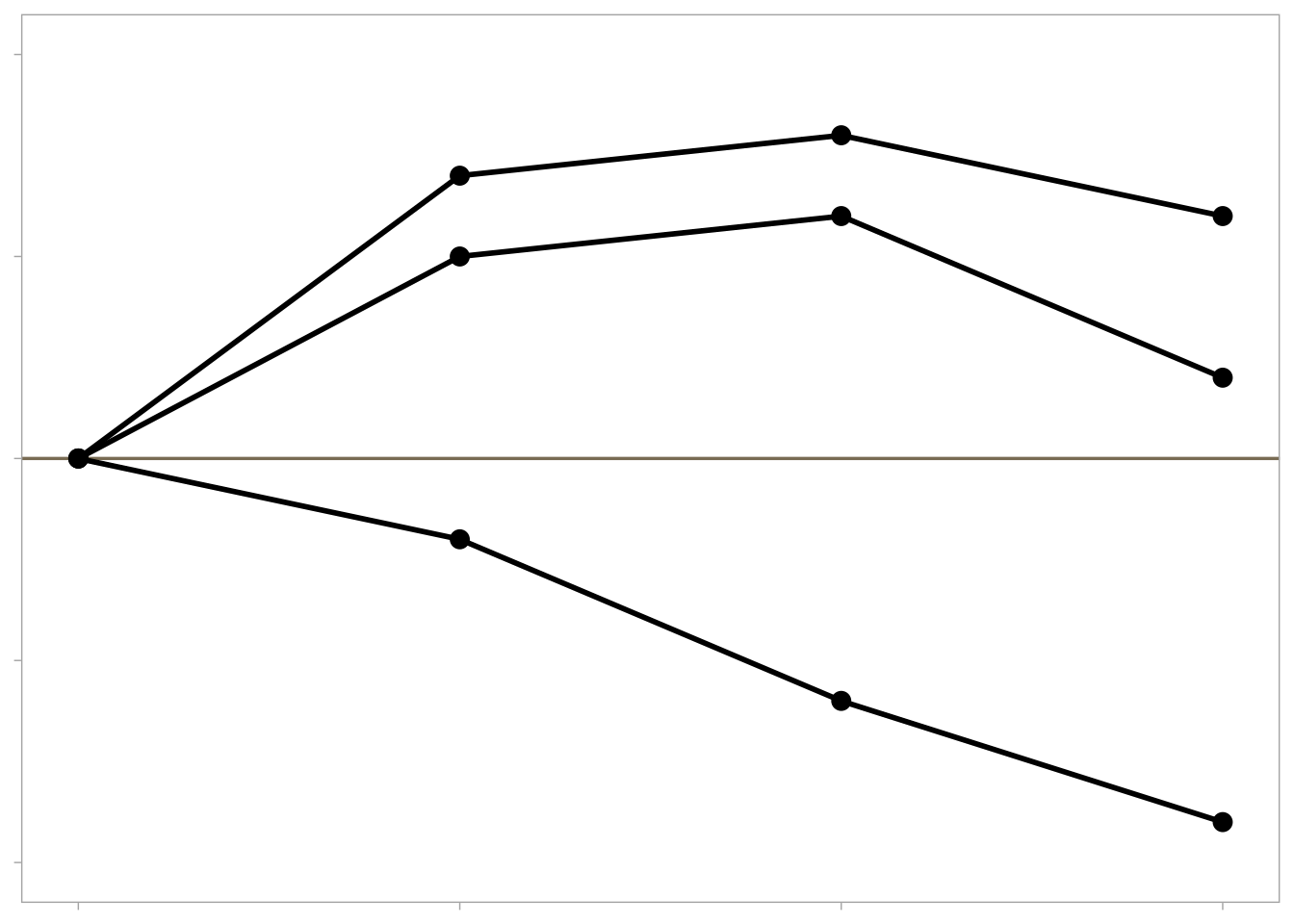
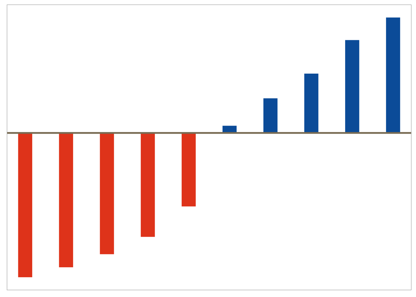
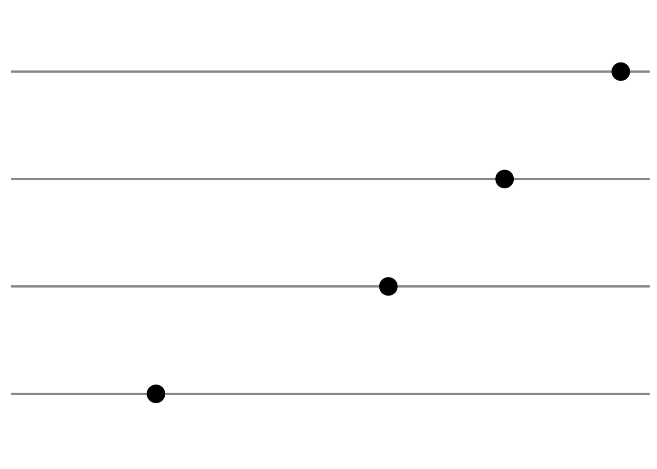
Deviation (i.e. change from baseline)
Example graphs for displaying deviations from a common reference point or baseline include line plots displaying change from baseline or a diverging barchart such as a waterfall plot.
# generate data and plot with a minimal theme tibble (trt = rep (c ("Dose 1" , "Dose 2" , "Dose 3" ), each = 4 ),visit = rep (c (1 , 2 , 3 , 4 ), 3 ),response = c (0 , 0.7 , 0.8 , 0.6 ,0 , 0.5 , 0.6 , 0.2 ,0 , - 0.2 , - 0.6 , - 0.9 )%>% ggplot (aes (x = visit, y = response, group = trt)) + geom_hline (yintercept = 0 ,colour = "wheat4" ,linetype = 1 ,size = 0.6 + geom_point (size = 3 ) + geom_line (size = 1 ) + scale_y_continuous (limits = c (- 1 , 1 ), breaks = c (- 1 ,- 0.5 , 0 , 0.5 , 1 )) + theme (legend.position = "none" ,axis.title.y = element_blank (),axis.text.y = element_blank (),axis.title.x = element_blank (),axis.text.x = element_blank (),panel.grid.minor = element_blank (),panel.grid.major = element_blank ()
Warning: Using `size` aesthetic for lines was deprecated in ggplot2 3.4.0.
ℹ Please use `linewidth` instead.
## generate data tibble (x = 1 : 10 ,ratio = sort (runif (10 , 0 , 2 ))) %>% mutate (col_flag = if_else (ratio > 1 , 1 , 0 )) %>% ggplot (aes (color = factor (col_flag))) + geom_segment (aes (x = x,xend = x,y = 1 ,yend = ratiosize = 8 ) + geom_hline (yintercept = 1 ,colour = "wheat4" ,linetype = 1 ,size = 1 + ggColor (color.hues = c (2 , 1 )) + theme (panel.grid.minor = element_blank (),panel.grid.major = element_blank (),axis.ticks = element_blank (),axis.text = element_blank (),legend.position = "none" ,axis.title.x = element_blank (),axis.title.y = element_blank ()
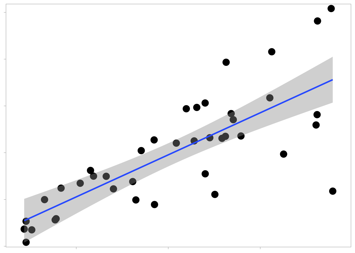
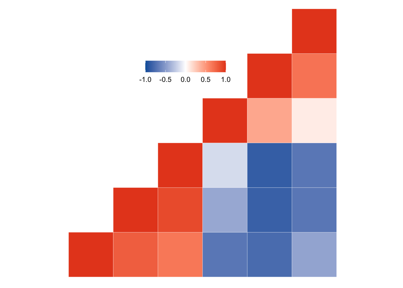
Correlation
For displaying the relationship between them two or more variables, x-y displays such as scatter plots and heatmaps are useful starting points.
tibble (cause = c (runif (40 , 1 , 10 )),effect = cause * (rnorm (40 , 2 , 0.5 )) + rnorm (40 , 0 , 1 )%>% ggplot (aes (x = cause, y = effect)) + geom_point (size = 4.5 ,shape = 16 ,position = "jitter" ) + geom_smooth (method = "lm" ) + scale_y_continuous (expand = c (0 , 0.5 )) + scale_x_continuous (expand = c (0 , 0.5 )) + theme (panel.grid = element_blank (),legend.position = "none" ,axis.title.x = element_blank (),axis.text.x = element_blank (),axis.title.y = element_blank (),axis.text.y = element_blank ()
`geom_smooth()` using formula = 'y ~ x'
<- mtcars[, c (1 , 3 , 4 , 5 , 6 , 7 )]<- round (cor (mydata), 2 )<- melt (cormat)# Get lower triangle of the correlation matrix <- function (cormat) {upper.tri (cormat)] <- NA return (cormat)# Get upper triangle of the correlation matrix <- function (cormat) {lower.tri (cormat)] <- NA return (cormat)<- get_upper_tri (cormat)<- melt (upper_tri, na.rm = TRUE )<- function (cormat) {# Use correlation between variables as distance <- as.dist ((1 - cormat) / 2 )<- hclust (dd)<- cormat[hc$ order, hc$ order]# Reorder the correlation matrix <- reorder_cormat (cormat)<- get_upper_tri (cormat)# Melt the correlation matrix <- melt (upper_tri, na.rm = TRUE )# Create a ggheatmap ggplot (melted_cormat, aes (Var2, Var1, fill = value)) + geom_tile (color = "white" ) + scale_fill_gradient2 (low = Novartis.Color.Palette[1 , 1 ],high = Novartis.Color.Palette[1 , 2 ],mid = "white" ,midpoint = 0 ,limit = c (- 1 , 1 ),space = "Lab" + coord_fixed () + guides (fill = guide_colorbar (barwidth = 7 , barheight = 1 )) + theme (axis.text = element_blank (),axis.title.x = element_blank (),axis.title.y = element_blank (),legend.title = element_blank (),panel.grid = element_blank (),panel.border = element_blank (),panel.background = element_blank (),axis.ticks = element_blank (),legend.justification = c (1 , 0 ),legend.position = c (0.6 , 0.7 ),legend.direction = "horizontal"
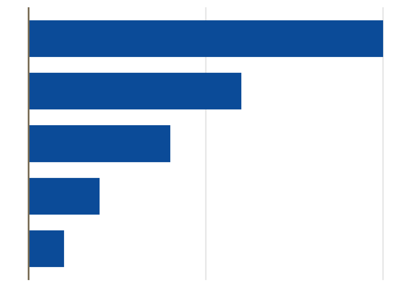
Ranking
Bar charts and dot plots are effective for disaplying quantities ordered highest to lowest (or vice versa).
<- data.frame (grp = c ("A" , "B" , "C" , "D" ),perc = c (1 , 0.8 , 0.6 , 0.2 )ggplot (my_data, aes (x = perc, y = reorder (grp, perc))) + geom_point (size = 6 ) + scale_x_continuous (breaks = seq (0 , 1 , 0.2 ),limits = c (0 , 1 )) + theme_minimal () + theme (panel.grid.major.y = element_line (colour = "grey60" , size = 0.8 ),panel.grid.major.x = element_blank (),panel.grid.minor = element_blank (),axis.title.x= element_blank (),axis.text.x= element_blank (),axis.title.y= element_blank (),axis.text.y= element_blank ()
Warning: The `size` argument of `element_line()` is deprecated as of ggplot2 3.4.0.
ℹ Please use the `linewidth` argument instead.
<- data.frame (trt= c ("A" , "B" , "C" ,"D" ,"E" ),cause= c (1 ,2 ,4 ,6 ,10 ),highlight = c (2 ,1 ,2 ,2 ,2 ))ggplot (df, aes (x= trt, y= cause, group= trt)) + theme_minimal (base_size= 18 ) + geom_bar (width= 0.7 ,fill= Novartis.Color.Palette[1 ,1 ], stat = "identity" ) + scale_y_continuous (breaks= c (0 , 5 , 10 )) + geom_hline (yintercept = 0 , colour = "wheat4" , linetype= 1 , size= 1 )+ coord_flip () + theme (legend.position= "none" ,panel.grid.minor.x = element_blank (),panel.grid.minor.y = element_blank (),panel.grid.major.y = element_blank (),axis.ticks = element_blank (),axis.title= element_blank (),axis.text= element_blank ()
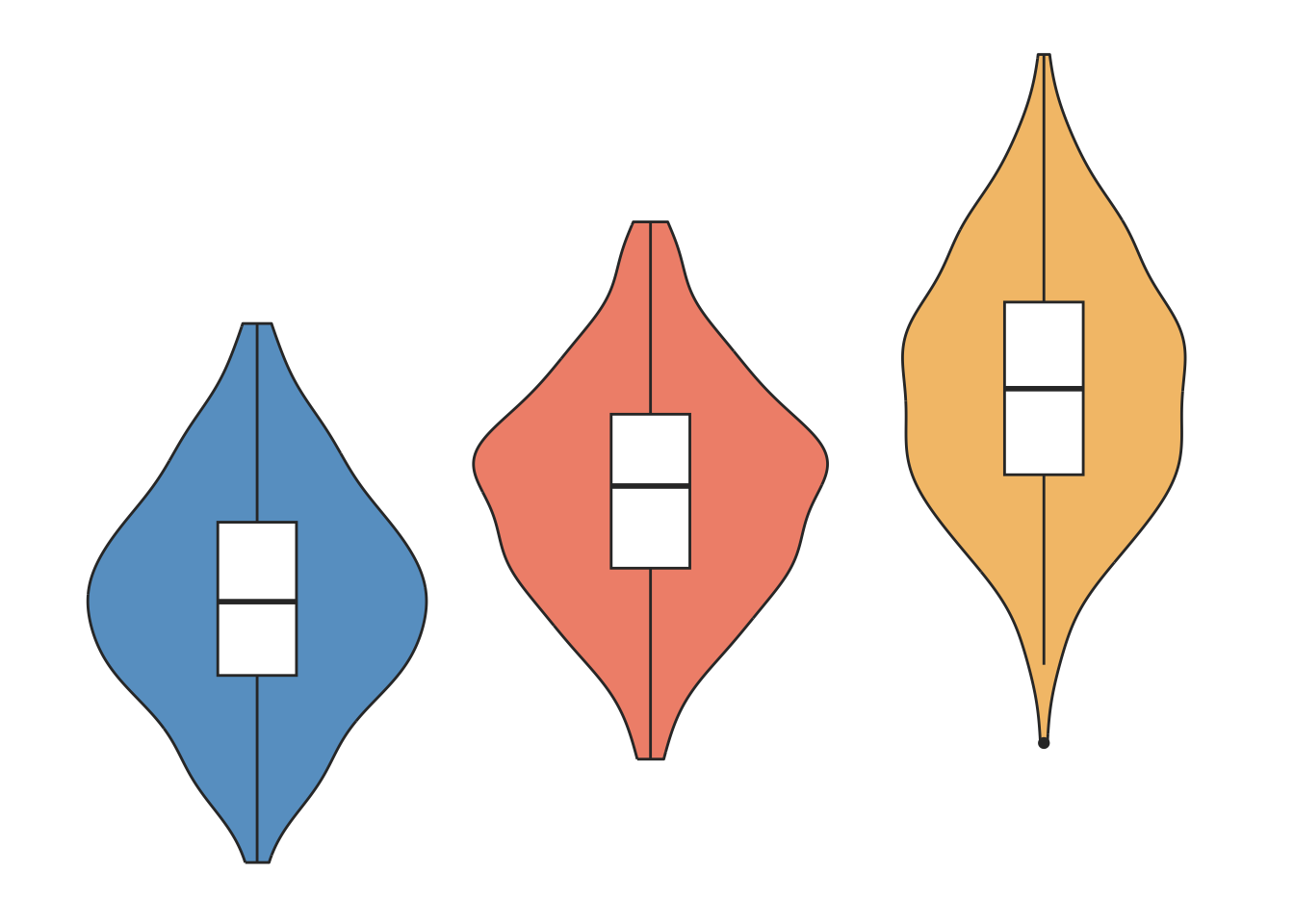
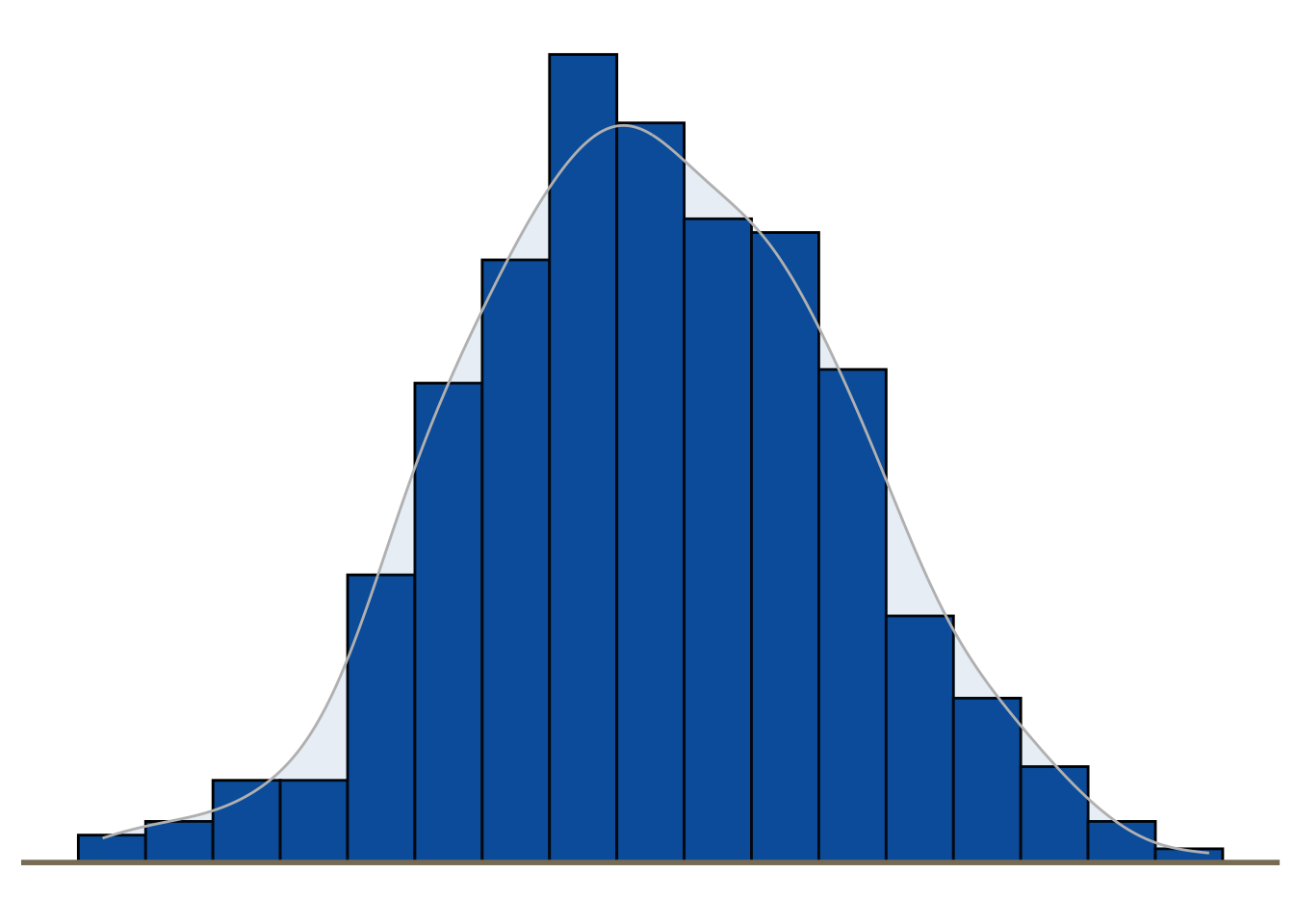
Distribution
Histograms, density plots, boxplots and violin plots are common displays for visualising the distribution of a variable.
### dummy data generation set.seed (131 )<- 135.5 # population mean; <- 5.5 # sd of population mean across trials <- rnorm (200 , mu1, sd1) <- 140.1 # population mean; <- 5.9 # sd of population mean across trials <- rnorm (200 , mu2, sd2) <- 145.5 # population mean; <- 7 # sd of population mean across trials <- rnorm (200 , mu3, sd3)<- c (NVS301,NVS201,SOC101)<- 1 : 600 1 : 200 ] = "NVS301" 201 : 400 ] = "NVS201" 401 : 600 ] = "SOC101" <- 1 : 600 1 : 200 ] = 1 201 : 400 ] = 2 401 : 600 ] = 3 # Put in to simple data frame <- data.frame ( treatment = factor (trt, levels = c ("NVS301" , "NVS201" , "SOC101" )),bpm = bpggplot (dat1, aes (x= as.factor (treatment), y= bpm, fill= treatment)) + geom_violin (trim= TRUE )+ ggFill (color.values= c ("Tint1" ))+ geom_boxplot (width= 0.2 , fill= "white" )+ #scale_fill_brewer(palette="RdBu") + theme_minimal () + theme (legend.position= 'None' ,panel.grid.minor = element_blank (),panel.grid.major = element_blank (),axis.ticks.x = element_blank (),axis.title= element_blank (),axis.text= element_blank (),panel.background = element_blank ()
set.seed (1234 )<- data.frame (cond = factor (rep (c ("A" ,"B" ), each= 200 )), rating = c (rnorm (200 ),rnorm (200 , mean= .8 )))# Histogram overlaid with kernel density curve ggplot (dat, aes (x= rating)) + geom_histogram (aes (y= ..density..), binwidth= .4 ,colour= "black" , fill= Novartis.Color.Palette[1 ,1 ]) + geom_density (alpha= .1 , color = "gray" , fill= Novartis.Color.Palette[1 ,1 ])+ geom_hline (yintercept = 0 , colour = "wheat4" , linetype= 1 , size= 1 )+ theme_minimal () + theme (legend.position= 'None' ,panel.grid.minor = element_blank (),panel.grid.major = element_blank (),axis.ticks = element_blank (),axis.title= element_blank (),axis.text= element_blank (),panel.background = element_blank (),panel.border = element_blank ()
Warning: The dot-dot notation (`..density..`) was deprecated in ggplot2 3.4.0.
ℹ Please use `after_stat(density)` instead.
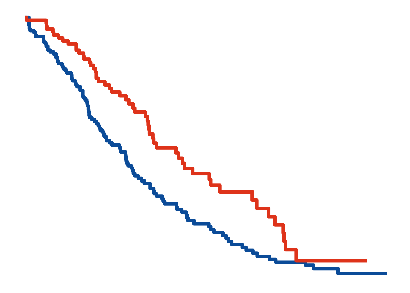
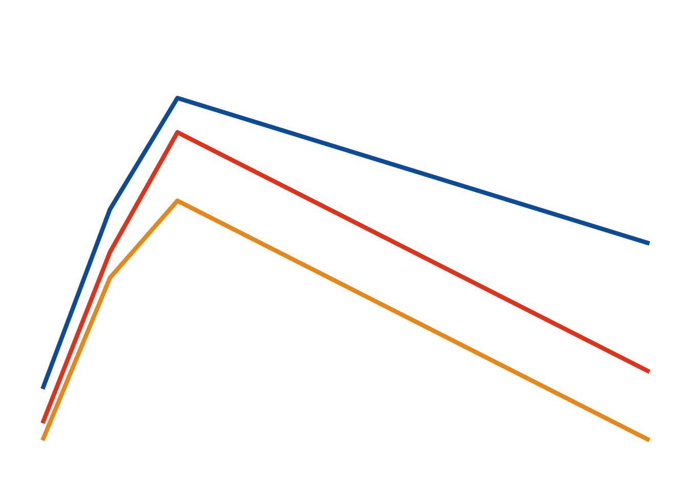
Change over time (i.e. evolution)
Line plots can be used for displaying how quantities evolve over time.
<- survfit (Surv (time, status) ~ sex, data = lung)<- autoplot (fit, conf.int = FALSE , censor = FALSE , surv.size = 2 )+ theme_minimal () + ggColor () + theme (legend.position= 'None' ,axis.ticks = element_blank (),axis.title= element_blank (),axis.text= element_blank (),panel.grid.minor = element_blank (),panel.grid.major = element_blank (),panel.background = element_blank ()
#make data <- data.frame (trt= rep (c ("Dose 1" , "Dose 2" , "Dose 3" ), each= 4 ),visit= rep (c (1 , 2 , 3 , 10 ),3 ),response= c (0.8 , 2.9 , 4.2 ,2.5 , 0.4 , 2.4 ,3.8 ,1.0 ,0.2 , 2.1 ,3.0 ,0.2 ))#head(df) # define a minimal theme <- theme_minimal (base_size = 12 ) + theme (legend.position= "none" ,axis.title.y= element_blank (),axis.text.y= element_blank (),axis.title.x= element_blank (),axis.text.x= element_blank (),panel.grid.minor= element_blank (), panel.grid.major= element_blank ()ggplot (df, aes (x= visit, y= response, group= trt, color = trt)) + geom_line (size= 1.5 ) + ggColor () + scale_y_continuous (limits = c (0 , 5 ), breaks = c (0 ,2.5 , 5 )) +
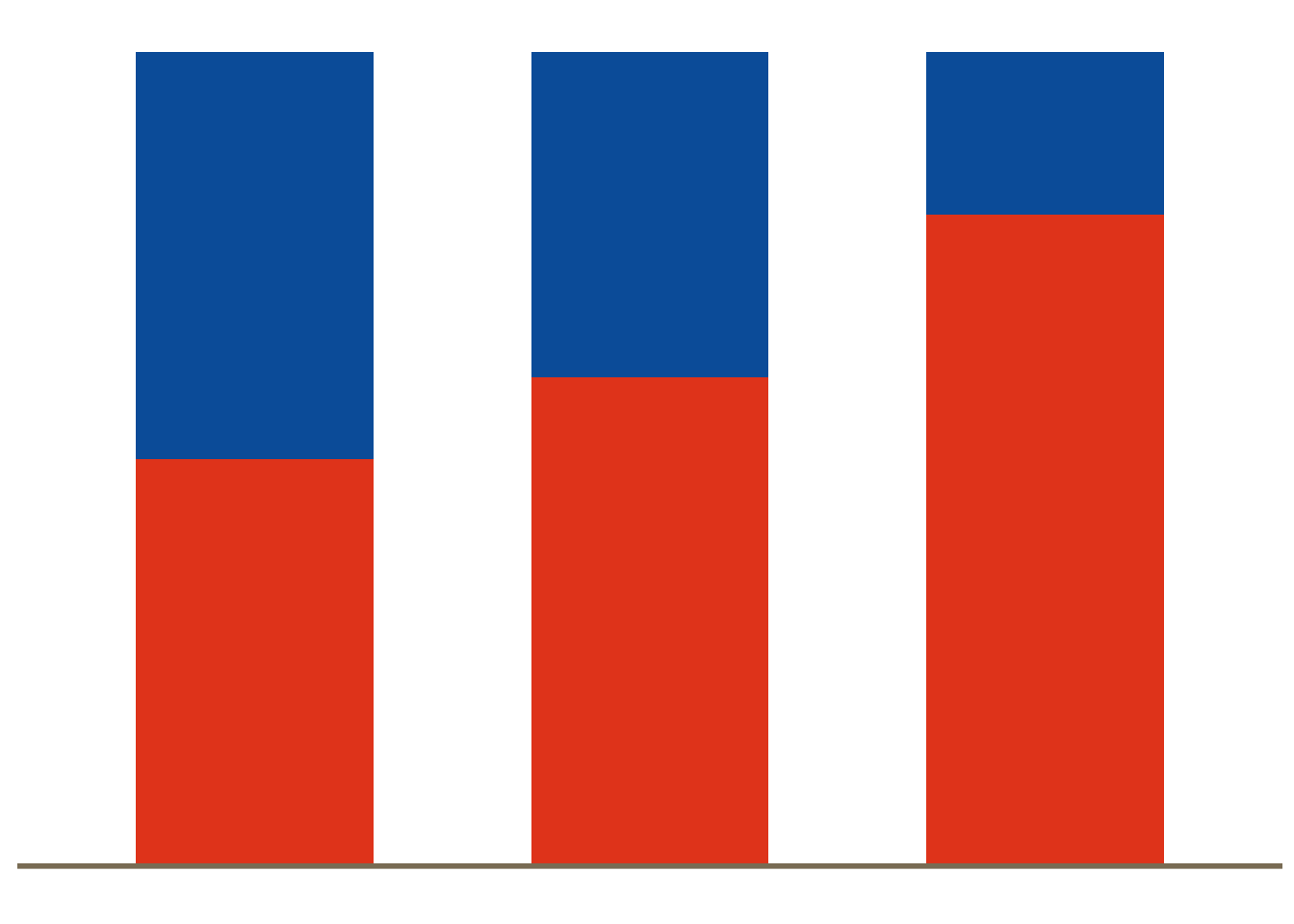
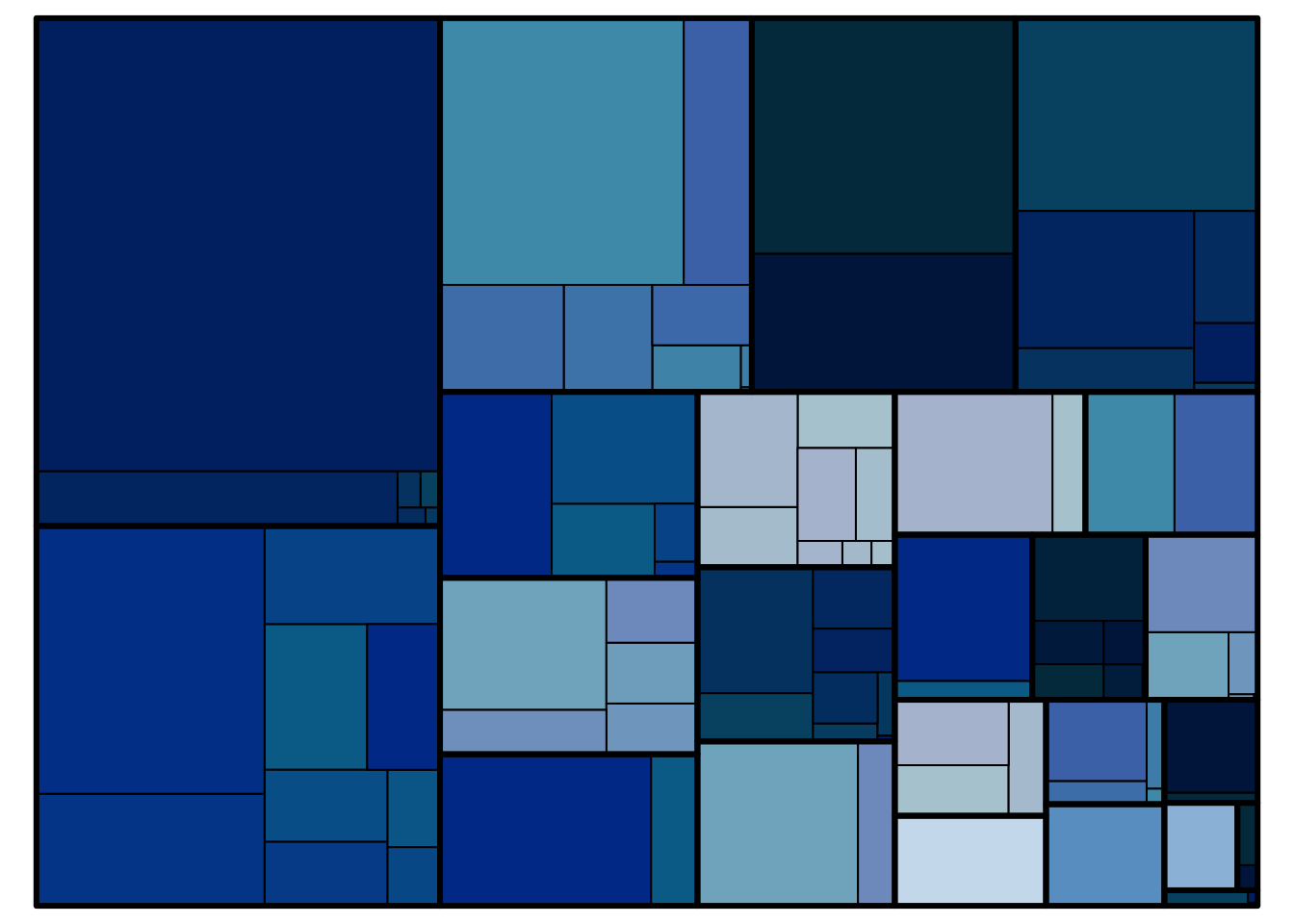
Part-to-whole
For displaying sub‐divisions of a whole (e.g. the percentage of patients in a subgroup), pie charts, bar charts and stacked barcharts can be used.
# Generate data <- data.frame (trt= c ("A" ,"A" ,"B" , "B" ,"C" , "C" ),subgroup = c ("1" ,"2" ,"1" ,"2" ,"1" ,"2" ),percent= c (0.5 ,0.5 ,0.4 ,0.6 ,0.2 ,0.8 )ggplot (df, aes (x = factor (trt), y = percent, fill = subgroup)) + geom_bar (width= 0.6 , stat= "identity" ) + scale_y_continuous (breaks= c (0 , 0.5 , 1 )) + ggFill () + # scale_fill_brewer(palette="Blues") + geom_hline (yintercept = 0 , colour = "wheat4" , linetype= 1 , size= 1 )+ theme_minimal (base_size= 9 ) + theme (panel.grid.minor= element_blank (), panel.grid.major= element_blank (),panel.border= element_blank (),axis.ticks = element_blank (), axis.text = element_blank (),legend.position= "none" ,axis.title.x= element_blank (),axis.title.y= element_blank ())data (business)treemap (business[business$ NACE1== "C - Manufacturing" ,], index = c ("NACE2" ,"NACE3" ), vSize = c ("employees" ), vColor = c ("employees" ),type = "index" , palette = Novartis.Color.Palette[,1 ], fontsize.labels = 0 , fontsize.title = 0 )
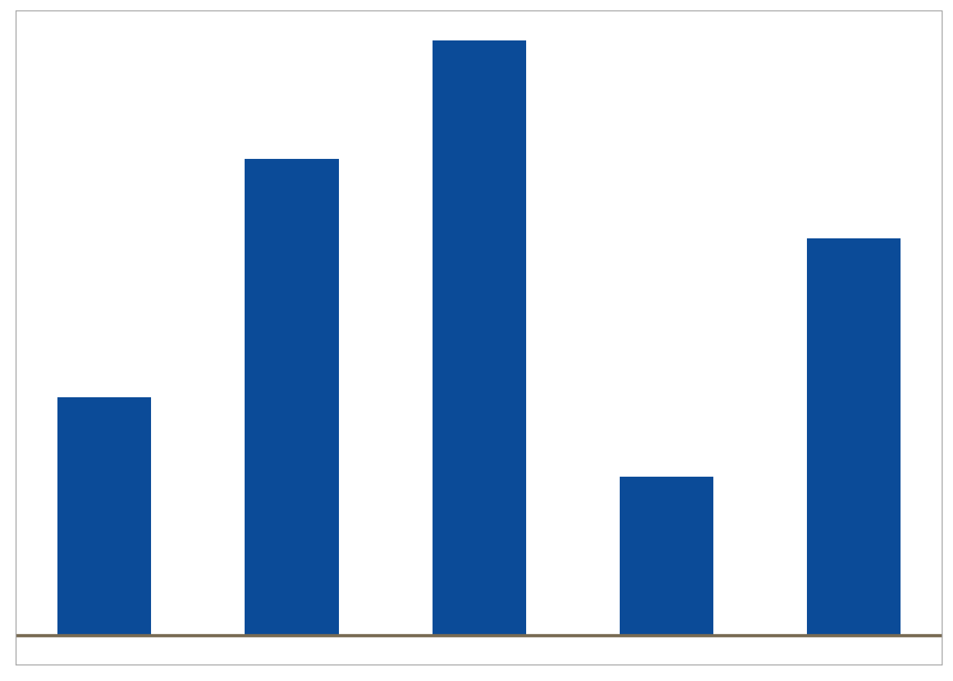
Magnitude
Dotplots, forest plots and barcharts are useful for displaying comparisons of size or magnitude (i.e. treatment differences)
<- data.frame (trt= c ("A" , "B" , "C" ,"D" ,"E" ),cause= c (4 ,6 ,10 ,12 ,15 ),highlight = c (2 ,2 ,2 ,1 ,2 ))ggplot (df, aes (x= c (4 ,1 ,5 ,2 ,3 ), y= cause, group= trt, fill= trt)) + geom_bar (width= 0.5 , stat = "identity" ) + geom_hline (yintercept = 0 , colour = "wheat4" , linetype= 1 , size= 0.8 )+ ggFill (color.values = "Hue" , color.hues = 1 ) + scale_y_continuous (breaks= c (0 , 5 , 10 )) + theme (panel.grid.minor= element_blank (), panel.grid.major= element_blank (),axis.ticks = element_blank (), axis.text.y = element_blank (),axis.text.x = element_blank (),legend.position= "none" ,axis.title.x= element_blank (),axis.title.y= element_blank ())
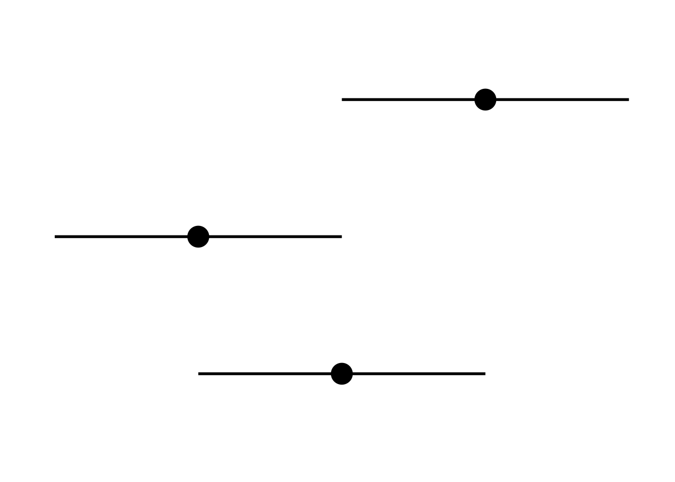
theme_set (theme_minimal (base_size= 26 ))<- theme (axis.title.x= element_blank (),axis.title.y= element_blank (),axis.text.x= element_blank (),axis.text.y= element_blank (),panel.grid.minor= element_blank (), panel.grid.major= element_blank ()<- data.frame (x= factor (c (1 ,2 ,3 )),y= c (2 ,1 ,3 ),low= c (1 ,0 ,2 ),hi= c (3 ,2 ,4 ))ggplot (align, aes (x= x, y= y, ymin= low, ymax= hi)) + geom_point (size= 7 ) + geom_linerange (size= 1 ) + + coord_flip ()